“La Descente”: Where Cycling Meets Summer Refreshment
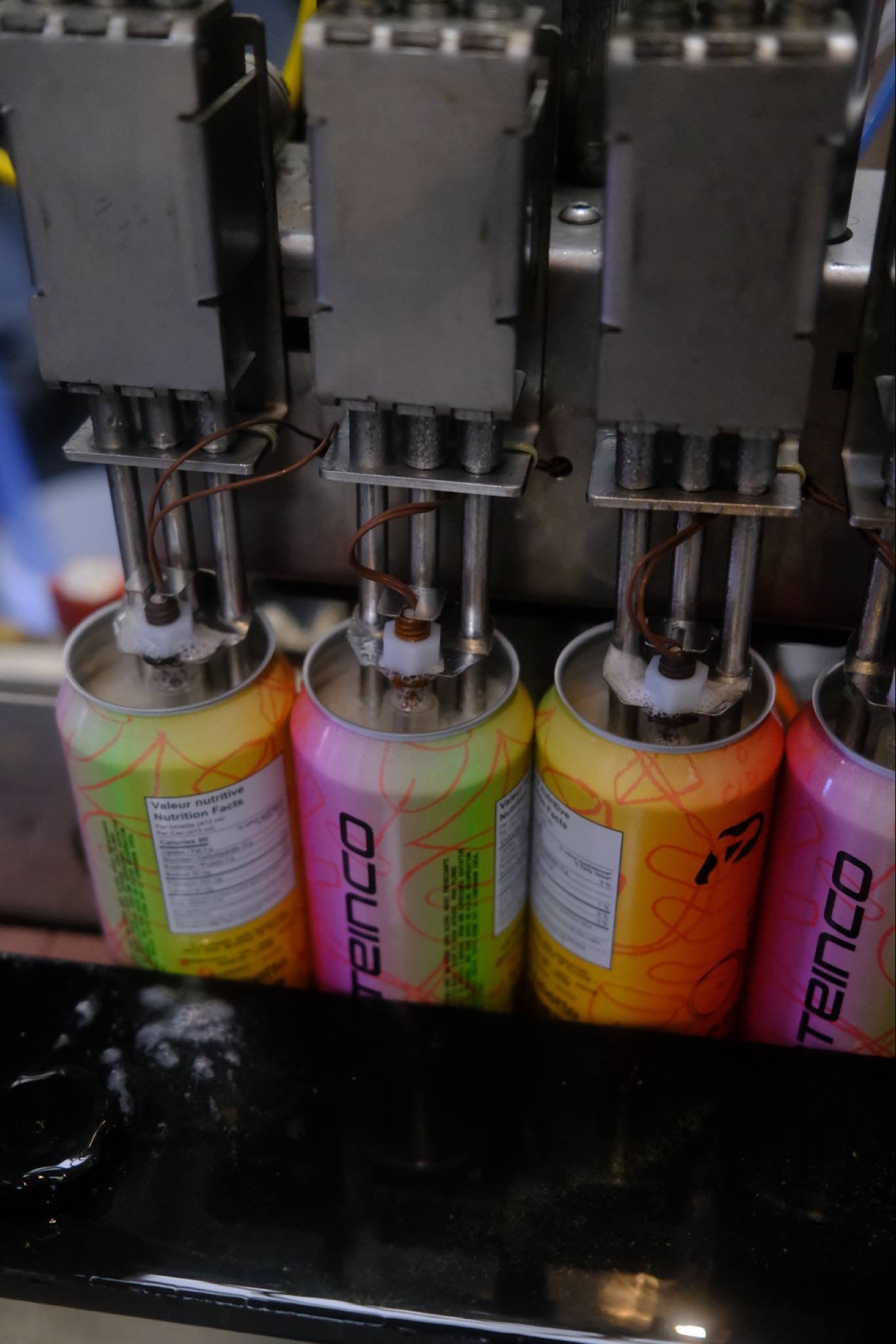
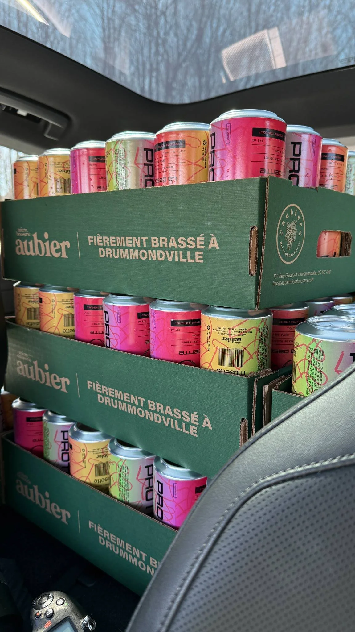
Last spring, we had the opportunity to work on a unique packaging project for a limited-edition non-alcoholic beer, born from a creative collaboration between our friends at Protein Co and Musette Café from Quebec City.
Bringing these two brands together was no small feat—both have strong, distinct visual identities. Protein Co leans into bold, clean aesthetics typical of a modern supplement brand, while Musette Café’s design language is rooted in cycling culture with a vintage-inspired, playful touch. The challenge? Finding common creative ground where both brands could shine without losing their personalities.
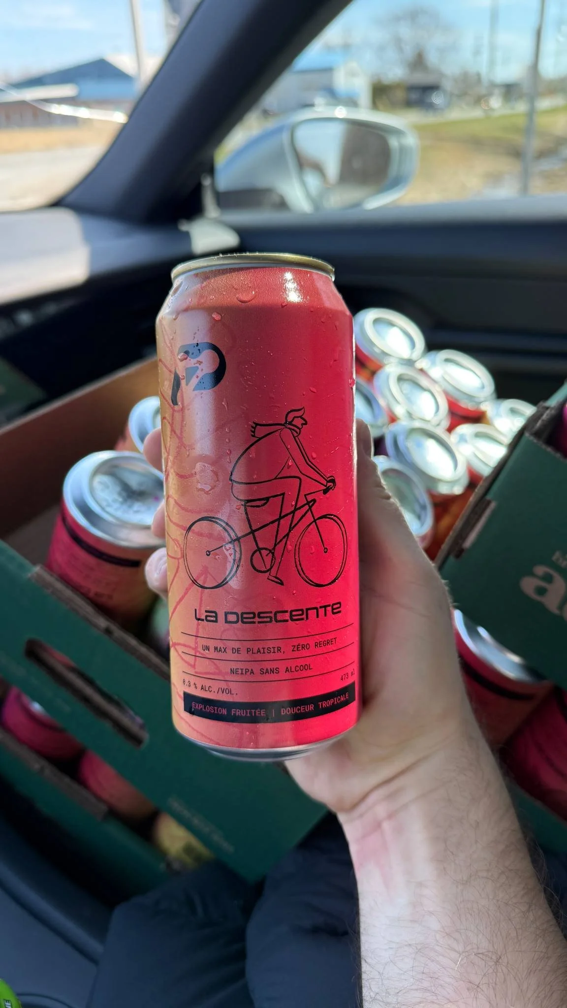
With summer approaching, Cimon from Protein Co suggested a tropical color palette to evoke the season. At the same time, Musette’s cycling roots needed to be front and center. We handled the product naming, illustration, and packaging design, resulting in a vibrant look that combines urban cycling iconography with Protein Co.’s sleek branding style.
The result: “La Descente” — a name that playfully refers to both riding downhill and the refreshing pour of a drink. The can features an illustration of a cyclist in motion, capturing the spirit of Musette, while the label structure aligns with Protein Co.’s supplement line for brand continuity.
We loved merging two worlds into one refreshing design. Cheers to more unexpected creative rides like this one.